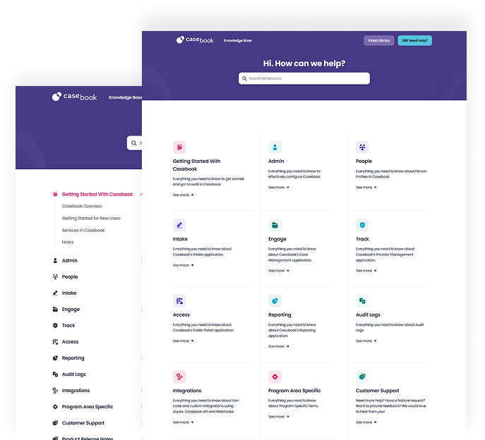
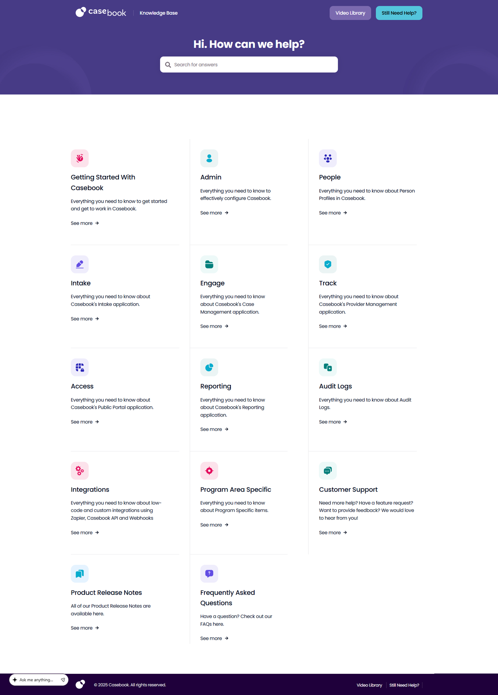
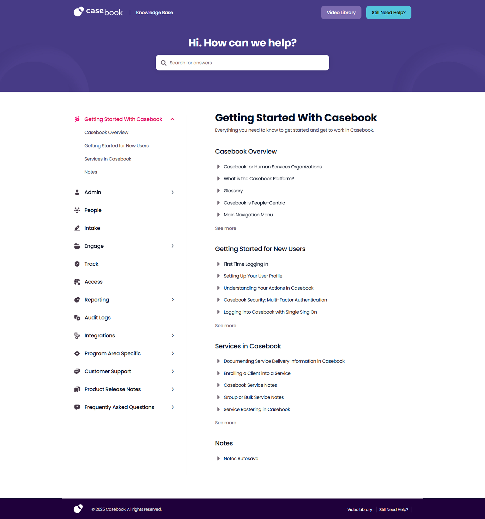
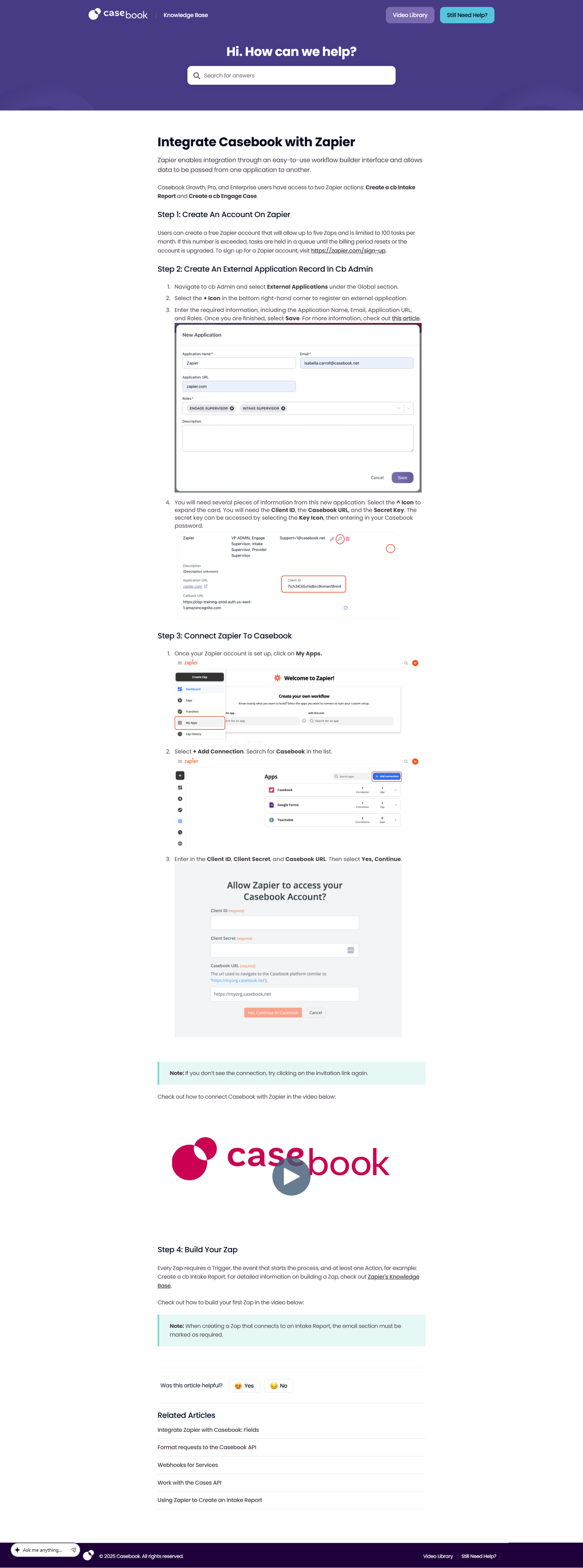
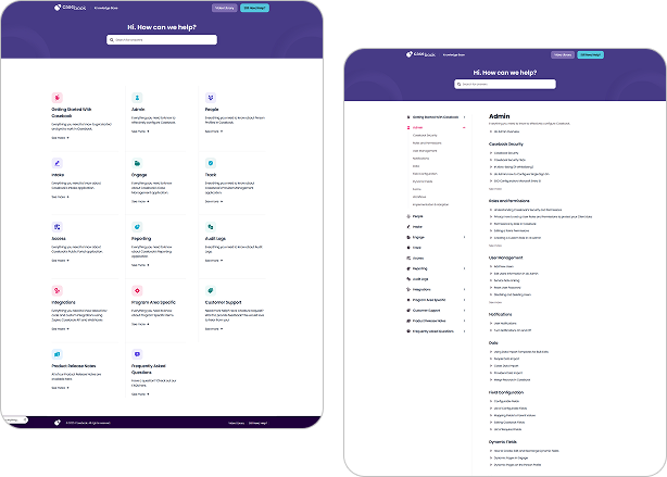
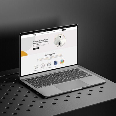
The GoHub Knowledge Base is a centralized support platform built to enhance the user experience within the Casebook ecosystem. Designed with clarity and usability in mind, it provides structured documentation, feature guides, and step-by-step tutorials to help teams efficiently navigate the platform.
The site features an intuitive layout with clearly categorized sections covering onboarding, reporting, administrative configuration, workflow management, and integrations. A powerful search function allows users to quickly find relevant resources, reducing support friction and improving productivity.
With its clean typography, organized content hierarchy, and fully responsive design, the Knowledge Base delivers a seamless and distraction-free learning experience. It serves as a strategic self-service hub that empowers users, streamlines operations, and strengthens overall platform adoption.
UI/UX Web Experience
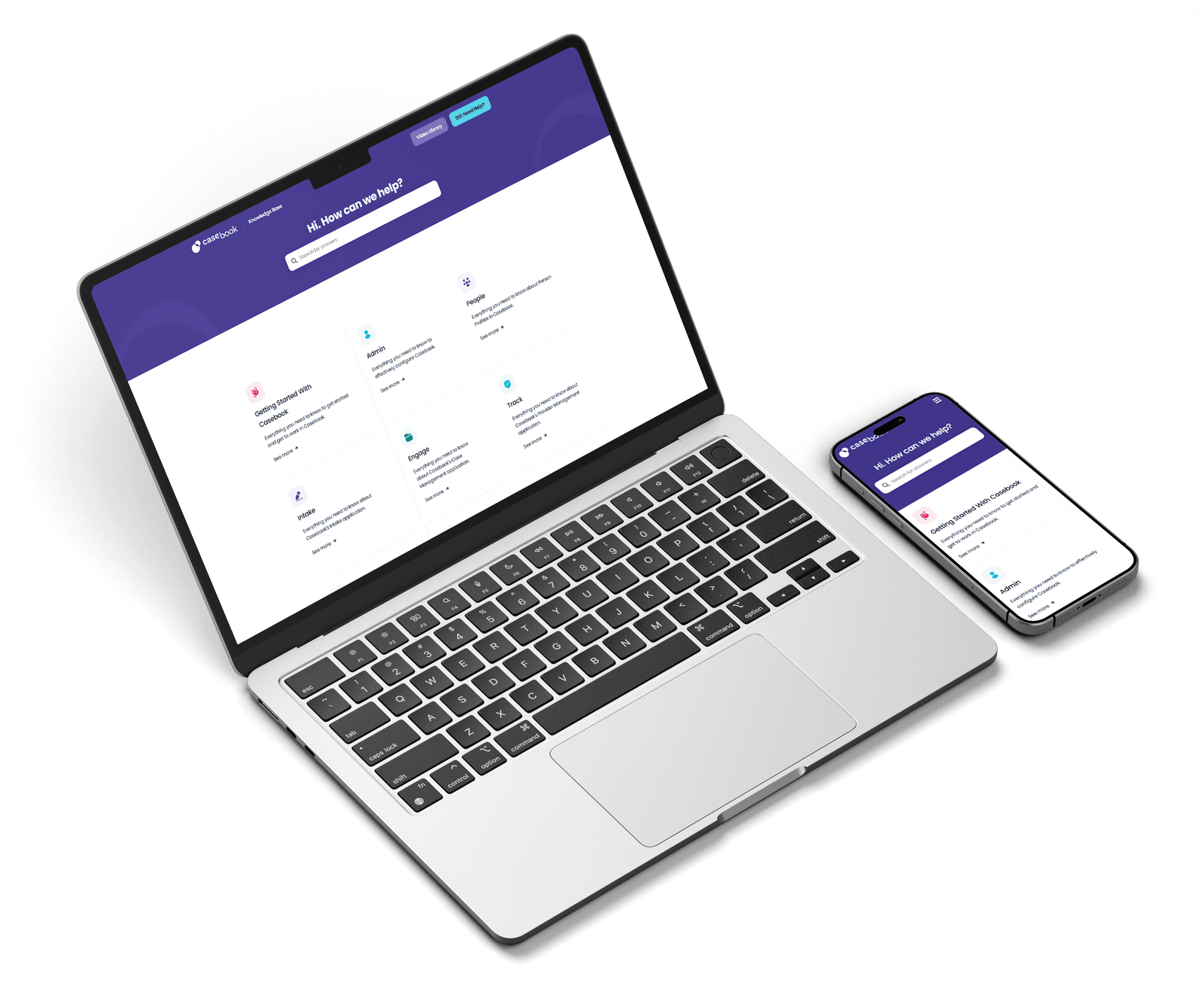
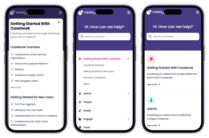
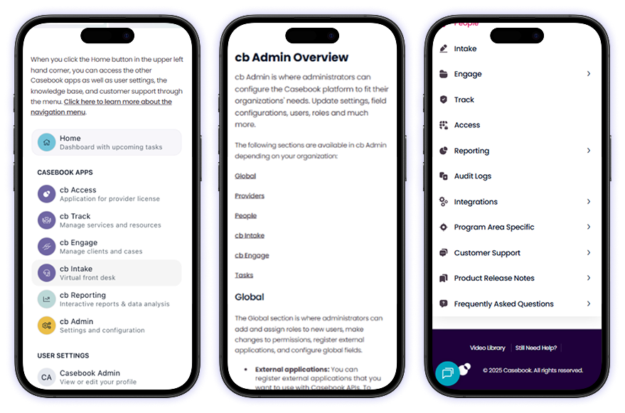
The GoHub Knowledge Base makes finding answers fast and effortless. Its clean, intuitive design highlights guides, tutorials, and documentation with clarity, while smart search and filters help users get exactly what they need. With clear visuals, consistent typography, and subtle color cues, navigating complex workflows becomes simple. Fully responsive on desktop, tablet, and mobile, it delivers a seamless self-service experience that boosts learning, efficiency, and productivity.
Click Me
Typography
heading
Size
weight
36
bold
title
Size
weight
22
SEMI bold
Subtitle
Size
weight
18
medium
Body
Size
weight
16
regular
color palette
#473B86
#1F003B
#54C5DC
#030D20
#FFFFFF
Website Design Process
Step 1 - Wire Framing
Wireframing is the foundation of the design process. At this stage, we focus on creating a clear structure and layout for the portfolio without the distraction of colors, fonts, or visuals. The goal is to map out the user journey, define content placement, and establish the overall flow of the page. This step ensures that every element has a purpose and the design remains user-friendly and intuitive before moving into detailed visuals.
Step 2 - Design & Development
This step brings the wireframe to life by adding visual design elements such as colors, typography, and imagery, then turning them into a fully functional website. It’s where creativity meets code to build a polished and engaging portfolio experience.
Step 3 – Testing & Launch
Wireframing is the foundation of the design process. At this stage, we focus on creating a clear structure and layout for the portfolio without the distraction of colors, fonts, or visuals. The goal is to map out the user journey, define content placement, and establish the overall flow of the page. This step ensures that every element has a purpose and the design remains user-friendly and intuitive before moving into detailed visuals.
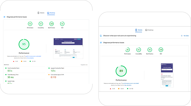
Mobile Responsive
Accessible Learning on Every Device
Every article, guide, and resource is optimized for smooth reading across smartphones, tablets, and desktops. Clean formatting ensures structured content remains easy to scan on smaller screens. Fast loading speeds support uninterrupted research and browsing. Navigation stays simple and distraction-free on any device.
Built for Clarity & Accessibility
Information architecture is designed for quick discovery of topics and categories. Responsive layouts adjust intelligently to maintain readability and visual balance. Whether reviewing documentation or exploring updates, the experience remains consistent and professional across all screen sizes.
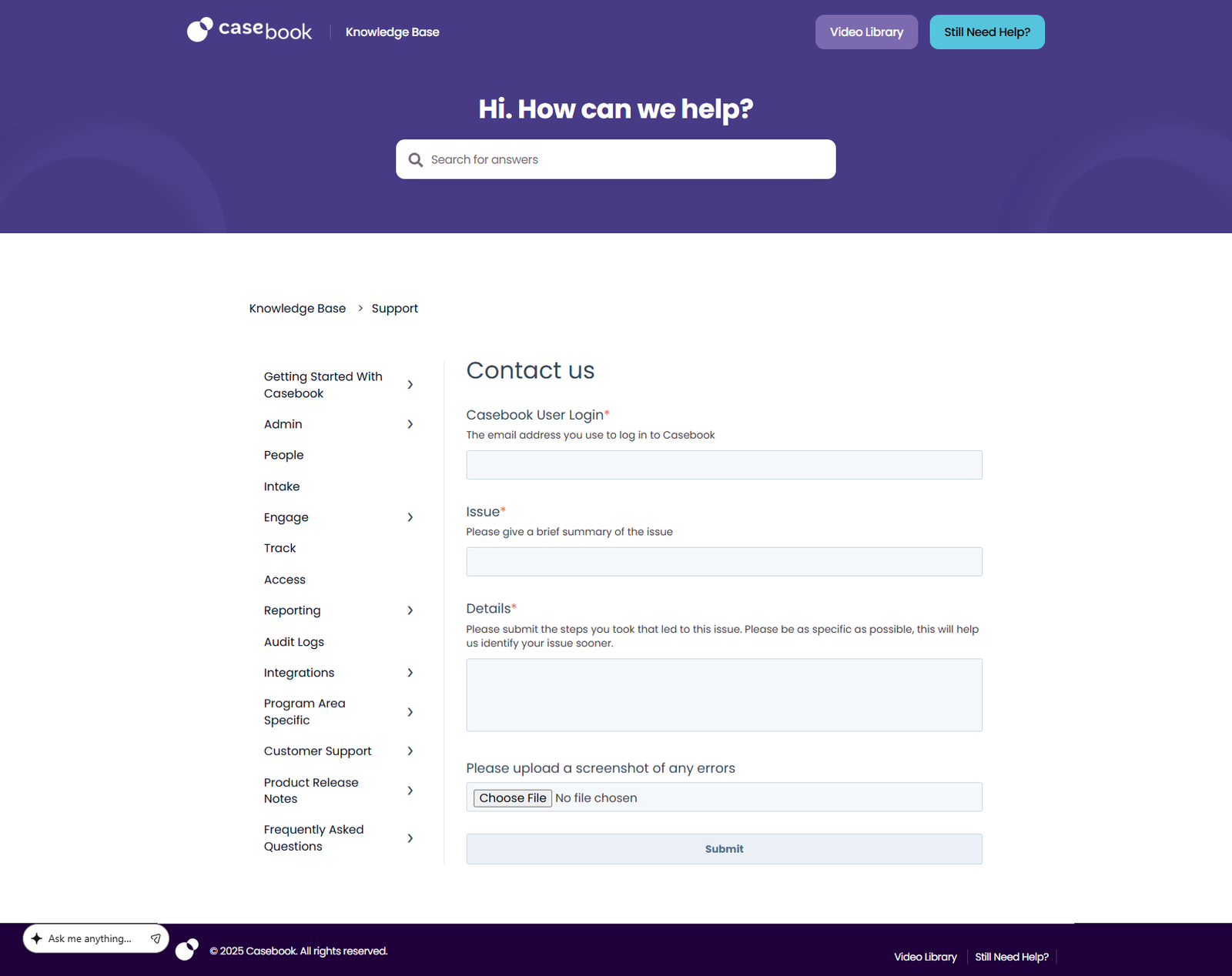
We’re here to help! Whether you have a question about our services, need support, or want to collaborate, feel free to reach out. Simply fill out the form below and our team will get back to you as soon as possible.
We’ll use your information to respond to your search or request. For more details, please refer to our privacy policy.


