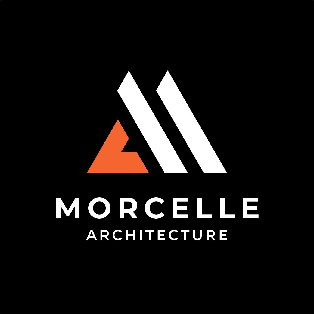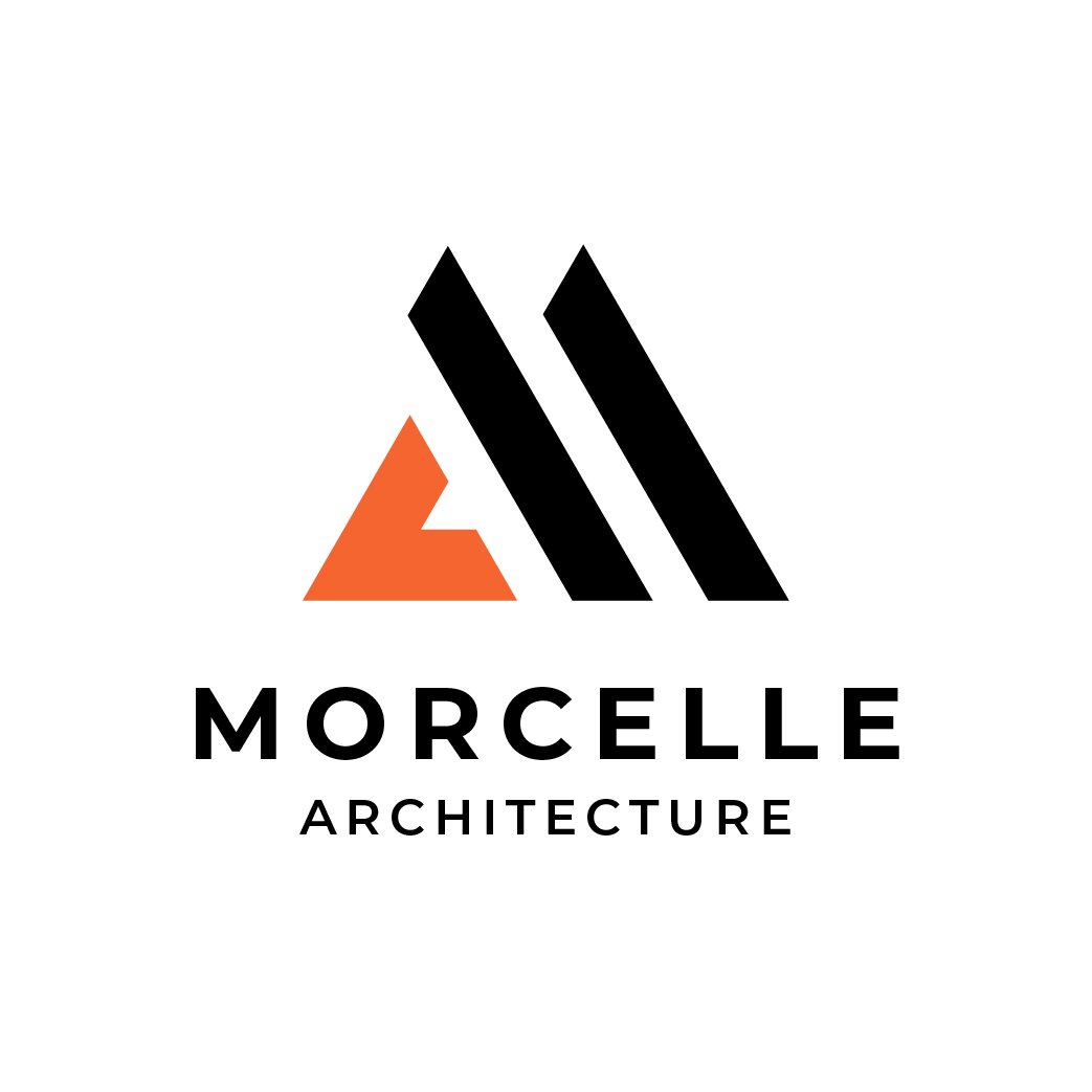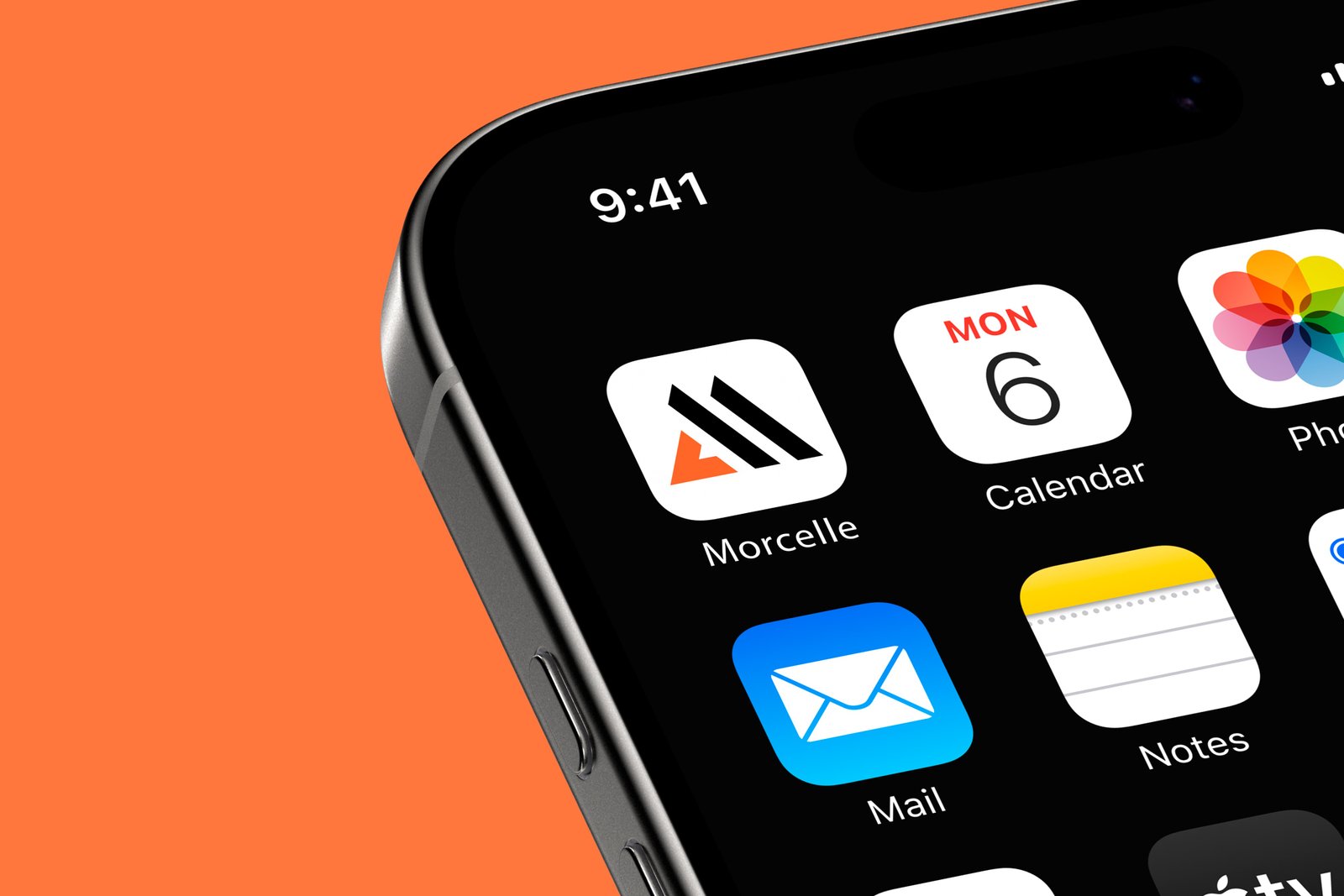
This branding project for Morcelle Architecture showcases a modern and geometric approach to visual identity. The core logo revolves around a stylized “M” crafted from bold geometric shapes — an orange triangle on the left and two clean parallel lines on the right. Across variations, this emblem is placed over different backgrounds including black, white, and orange, allowing for versatile applications across print and digital formats. The wordmark “MORCELLE” appears in a clean, sans-serif font, exuding professionalism and strength, while the subtitle “ARCHITECTURE” rests below in a smaller type size to reinforce the firm’s industry. Each version is minimalist and impactful, with thoughtful balance between typography and shape, communicating precision, creativity, and modern architectural vision. The color scheme — black, white, and vibrant orange — supports a bold, contemporary feel, ideal for an architecture or design studio seeking to portray structure, order, and innovation. This visual identity system is adaptable for use on business cards, project presentations, signage, websites, and branding collateral.