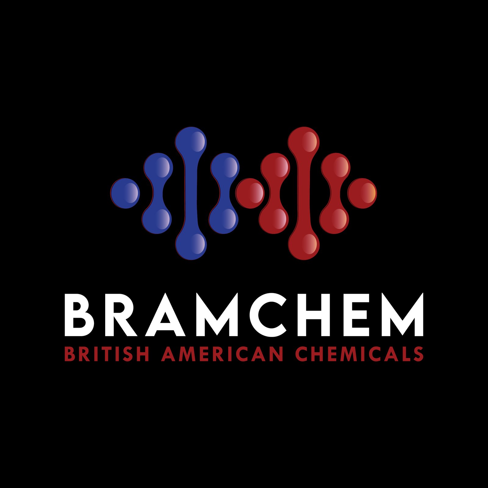
The logo design for Bramchem — British American Chemicals — captures a scientific and professional identity through a stylized molecular structure placed above a clean typographic wordmark. The molecular icon is constructed from interconnected spheres and lines, symbolizing chemical bonds and molecular networks, which directly reflect the company’s industry focus. The primary version features a two-tone color approach, with one half of the structure in deep blue (#2A2B74) and the other in maroon (#650D0D), representing balance and dual heritage. The company name “BRAMCHEM” is set in the bold and modern Lemon Milk sans-serif font, while the tagline “BRITISH AMERICAN CHEMICALS” sits neatly below in smaller text for clear hierarchy. Gallery variations of the logo adapt seamlessly across dark red, black, and white backgrounds, using white and colored molecular structures to maintain clarity and brand recognition. These versions ensure high legibility and flexibility across digital, packaging, print, and lab-based materials. Overall, the logo system conveys precision, innovation, and a contemporary scientific image — perfectly tailored for a global chemical manufacturing brand.